Topic - Getting started
Welcome to your workspace
Getting familiar with your "workspace"
Welcome to Everypocket!, or EP for short. From this moment, you are in control of your money. Let us go through the stuff you will see on the homepage, which is the part you might be spending your time the most on EP.
EP's design goal.
EP is budget-oriented personal finance software, and when we say budget, not only we refer to the activity of putting the amount for each spending category, but also being actively aware of what's happening to your budget when you are making purchases. Many people get "lost" sometimes when it comes to tracking their transaction, only to find out that they are spending too fast for the budget they allocated. EP is aimed to strike a balance between tracking your transaction and budgeting your spending. So everything that you see in EP, the way it's designed (especially the homepage) is the realization of that mindset.

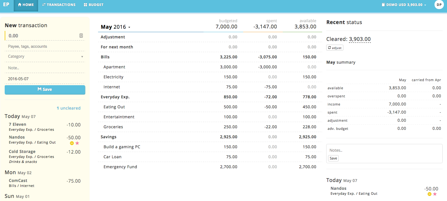
The home page is separated into 3 sections to make sure you are actively aware of what's happening during the month, they are transactions, budget and summary panel, each with their own purpose.
Transaction panel
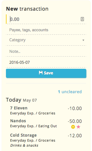
This is where you are going to spend most of your time when it comes to tracking your spending and income. It's designed to be simple, quick and laser-focused to your flow. All the things displayed in the transaction panel is to make you aware of what's happening on your transaction.

First, you'll see the transaction form which you can use to quickly add a new transaction, you can use common keyboard shortcuts to rapidly add transactions.
Secondly, you'll see a list of uncleared and claimable transactions (we'll talk about that on the other topics which you can check out on the sidebar), if there are no uncleared or claimable transactions, they will be automatically hidden to not distract you.
Thirdly, you will see the list of your recent transactions, they are carefully grouped by day to let you know your daily spending for the last 3 days. All the necessary information such as amount, tags, category, cleared / starred, etc are shown as well. You can click each transaction here to launch the quick action menu (we talk about that on the other topics about managing transactions).
Budget panel
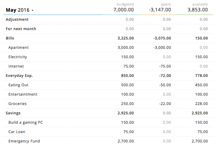
Budget panel is another most important thing that you can't miss. This is where you'll design your budget throughout the month. That's right, budgeting is a continuous thing and you might want to keep doing it as you go along, adjusting to your spending behavior. We talk about budgeting extensively on the budgeting topics, which you can click from the sidebar.

In the budget panel, you can see information such as amount budgeted, the amount spent, remaining balance, and if there's any amount you have to budget. You can click each amount field to update the budget amount. When you click the month name, you can access the quick menu to create categories and such. You can click the month row to see the summary of the month, or you can click each category row to access the category summary for the current month.
Summary panel
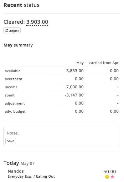
This is where you'll be seeing a lot of important information about your spending and budgeting activities. In the month summary, which you can access by clicking the month row (they are shown by default), you'll see things such as your recent balance summary, and if there are any incoming transactions. You'll also see your budget summary such as overspent, adjustment and carry over from last month.

You'll also see if there are any starred transactions (check out our transactions topics) for the month. If you want to take note of what's happening, say that you are going over budget or if there's any event regarding your personal finance situation for the current month, there's a note field which you can use to record them.